


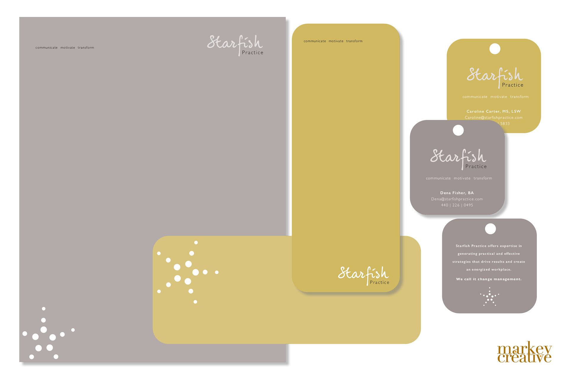
Starfish Practice wanted something really different and simple. They had been living with a hodgepodge of images but none of them felt energetic, or unique, nor did they reflect their idea of transformation. We selected a super friendly letter treatment, employed a sophisticated color pallet and introduced a mark that was refined down to the simplest form. We took the edge off with rounded corners and made their business card a hang tag too - just to keep it front and center for their clients.